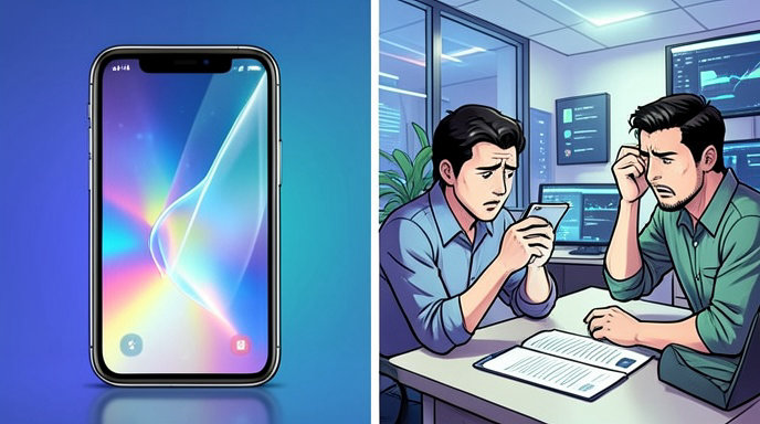
Apple's Liquid Glass Redesign: Balancing Aesthetics and Usability
TL;DR
- Apple is adjusting Liquid Glass after user feedback, focusing on better readability and more control over transparency.
- The company is adding a transparency slider, refining sidebars, and making interface elements more legible by changing how content shows through the design.
- The redesign remains a core part of Apple’s broader software look for iOS 26 and related platforms, but Apple is now clearly trying to soften the tradeoff between style and usability.
Apple’s Liquid Glass Redesign: Balancing Aesthetics and Usability
Apple is revising its Liquid Glass interface after early criticism that the design could be visually striking but sometimes harder to read. The latest changes suggest Apple is trying to preserve the glassy, futuristic look while making menus, sidebars, and controls easier to use in everyday settings.
Apple responds to readability complaints
Apple says it has heard user feedback and is making changes to the “foundations” of how Liquid Glass works. The company is now prioritizing “exceptional readability” by diffusing complex content behind translucent panels so interface elements stand out more clearly.
That shift matters because Liquid Glass was originally built around heavy transparency, reflections, and layered depth. Those effects helped define the design language, but they also created complaints that text and controls could be harder to distinguish depending on the background.
The biggest change: a transparency slider
The most user-facing update is a new slider that lets people control transparency from fully opaque to completely clear. Apple says this should accommodate different preferences, giving users a way to dial down the visual intensity without abandoning the design entirely.
This is a notable move because it turns Liquid Glass from a mostly fixed aesthetic into something more customizable. In practice, it gives Apple a way to keep the signature style while acknowledging that not everyone wants the same amount of translucency on every screen.
Sidebars and icons are being refined
Apple is also changing sidebar behavior so sidebars extend to the full edge of the window, while refraction continues underneath them instead of stopping abruptly at the boundary. That should make the interface feel more cohesive and less visually chopped up.
Another complaint Apple appears to be addressing is icon treatment inside sidebars. Sidebar icons will retain their color rather than being stripped into a more muted presentation, which should improve recognition and help elements remain distinct at a glance.
From bold showcase to everyday usability
Liquid Glass was introduced as Apple’s broadest design overhaul in more than a decade, bringing translucent layers, shimmering surfaces, rounded corners, and a “clear” mode across iOS, iPadOS, macOS, watchOS, tvOS, and visionOS. Apple framed it as a unified design system built to feel more lively and responsive, with real-time rendering and visual effects that react to motion and content.
But bold design systems often face the same challenge: what looks impressive in a keynote can become tiring or inconvenient in daily use. Apple’s new adjustments indicate that it is treating Liquid Glass less like a finished statement and more like a living interface that needs tuning after real-world exposure.
Fans, critics, and the tradeoff Apple is trying to manage
Fans of Liquid Glass have praised the design for making Apple’s software feel more modern, immersive, and consistent across devices. The layered, translucent style also ties into Apple’s long-running focus on hardware-software harmony, with controls and navigation elements designed to echo the curves and materials of modern devices.
Critics, however, have argued that the visual flair sometimes comes at the cost of clarity. Early beta reporting has already noted Apple reducing transparency in some interface elements, making toolbars and buttons more solid in order to improve readability. That trend lines up with Apple’s latest statement that it is updating Liquid Glass to ensure content is easier to distinguish.
What this means for iOS 26 and beyond
The timing suggests Apple is still actively shaping the final version of iOS 26 and related updates before public release later this year. Since Liquid Glass is a cross-platform design language, these changes could affect not just the iPhone but also iPad, Mac, Apple Watch, Apple TV, and Vision Pro interfaces.
For developers, the message is also clear: Apple still wants apps to adopt the new look, but it is making the system more adaptable so designers can balance beauty and usability more precisely. That could reduce resistance and make the design easier to adopt at scale.
The bigger picture
Apple’s latest Liquid Glass updates show a familiar pattern in design history: a company launches a bold visual language, then refines it after users point out where style gets in the way of function. In this case, Apple is not retreating from Liquid Glass. It is recalibrating it so the aesthetic remains recognizable while the interface becomes easier to read, navigate, and live with every day.
Get All The Latest Updates Delivered Straight To Your Inbox For Free!