Hands-on With New Poweramp Beta: An Impressive Overhaul

There's a reason why Poweramp is termed as the best music player for locally stored files. Poweramp's wide array of features include gapless playback, crossfade, equalizers, sleep timer, support for multiple audio formats, and much more. Until yesterday, the legendary music player hadn't seen an update in twenty months. Developer Maxim Petrov released a beta preview for the music player yesterday.
I have been using the new Poweramp for a day now. In this post, we will take a look at what is new in Poweramp, and what works and what doesn't.
Startup Screen & Player User Interface
 |
| Left: Old startup screen, Right: New startup screen |
When you will open a fresh installation of Poweramp, you will get an "initializing" screen as shown above. Just like the previous UI, the startup screen won't be shown when the app is opened subsequently.
 |
| From left to right: Old UI, New UI, Blur Settings |
Once you get past the startup screen, you will be greeted by the new eye candy user interface. Unlike the old UI where the background color of every screen was set to as dark by default, the new UI extracts colors from the album art and mixes them to generate a blurred and gradient background. If you wish to customize the background on the main screen to your utmost liking, there is an option in settings which will let you customize the blur amount, intensity and saturation.

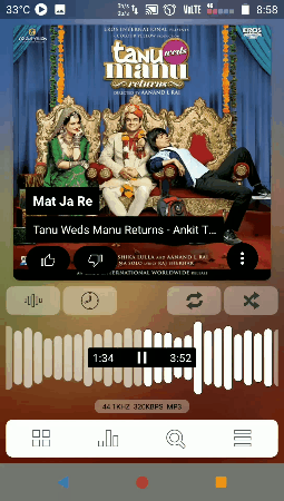
As compared to the previous UI, the play button is slightly smaller in the revamped interface. The forward and rewind buttons are no longer there, but their functionality is. To forward or rewind, you can simply swipe left or right. The distance of your touch will determine how much song length is skipped. Although the waveform is more pleasing to the eyes, I found the use of waveform to rewind (or forward) tracks limiting. At maximum, I could skip only a handful of seconds before my fingertip reached the edge of the screen. In the older user interface, this wasn't the case since a simple hold of the forward/rewind button would skip the desired length in shorter duration.
Here's a protip: pressing and holding the button showing the current duration of the song will restart the song.
Like the forward and rewind buttons, the rating bar has also been let go off. We now instead have the like and dislike buttons. In terms of functionality, the rating system was more diverse since it gave the user five rating options (that is the song could be rated out of 5), but here we have only one option of upvoting or downvoting the song. There was an option in old Poweramp builds to view top rated songs, but this beta preview doesn't have any options for sorting songs on the basis of likes and dislikes. But, who would listen (or locally store) a song they don't like? Clearly, the feature isn't fully developed yet, and since this is a beta build, there are bound to be features which are still a work in progress.
In the row of the like and dislike buttons, there is a three dotted menu right at the end. Upon clicking on the button, you will see five options - add to playlist, info/tags, lyrics, album art and delete. The options of adding a song to a playlist (playlists don't work altogether), viewing lyrics and deleting a song don't work in Preview Build 790. The remaining options - info/tags and album art - work just fine.
Another protip: you can dismiss the edit tags dialog box by swiping it up. The info screen and album art page can be closed by a downward swipe. The new animations are slick and buttery smooth. I tried the new Poweramp on a second generation Moto G (which runs a Snapdragon 400) and the animations were just as smooth as they were on my Redmi Note 3. There was not even a single frame drop on my Moto G2. The animations have been looked after very well. I'm impressed!
Another protip: you can dismiss the edit tags dialog box by swiping it up. The info screen and album art page can be closed by a downward swipe. The new animations are slick and buttery smooth. I tried the new Poweramp on a second generation Moto G (which runs a Snapdragon 400) and the animations were just as smooth as they were on my Redmi Note 3. There was not even a single frame drop on my Moto G2. The animations have been looked after very well. I'm impressed!

Talking about gestures and animations, there is a great bunch of them in this build of Poweramp. For example, you can use pinch to zoom in and pinch to zoom out gestures to change between row and grid views. And think about it, in the row view, the text is slightly enlarged and is easier to read along with more information. Similarly, when you pinch to zoom out, the view is changed to a grid, and you get to see more contents in lesser screen space. This is just like how you use the pinch gestures while viewing an image. When you zoom in, you see the details of the image clearly, and in this case, you get to view more information of the song along with a slightly enlarged text which is easier to read. So the gestures are not only well implemented, they are well thought off too. Once again, I can't help but admire.
The pinch gestures work on the songs, folders, and albums menu. The options of artist, genre, playlist, and queue haven't been implemented yet, but I expect to see the pinch gestures implemented in those sections. Poweramp developer Maxim Petrov has said that he will be adding the missing features to the app in the coming month, and a stable release is being targeted for May end or beginning of June.

There is also another useful gesture. When you jump from the player screen to any other section of Poweramp, the player minimizes to a bar at the bottom. This is similar to the bottom bar in the YouTube application. Through the bar, you can pause the playing song, and switch songs with a swipe.

You can also change the songs on the player screen by swiping either right or left. The beta preview supports colored notifications for Oreo.
 |
| Different visualizer types. Left: Fade Control, Right: Full Screen |
Below the album art on the player screen, there are options for changing the visualizer type, sleep timer, repeating the song, and shuffle.

The white bar at the bottom comprises of options for viewing the library, configuring the music equalizers, searching for a track and configuring settings and viewing the changelog. The library gives you a variety of options for viewing the music - all songs, folders, albums, artist, genres, playlist, and queue. In Preview Build 790, all songs, folders, and albums worked. On accessing queue, Poweramp crashed and the remaining options yielded no action when they were touched upon.
In the older builds of Poweramp, there was an option to assign equalizer presets according to the audio output (speakers, headsets etc) and songs and albums. By using this option, I could automate equalizers for a particular song I was listening to via headsets. I found this customization very useful. Sadly, I couldn't find this option in the new Poweramp. The rest of the options in equalizers have been carried over, and all of them worked fine.
 |
| Left to right: Assign EQ preset, equalizer options in new UI |
In the older builds of Poweramp, there was an option to assign equalizer presets according to the audio output (speakers, headsets etc) and songs and albums. By using this option, I could automate equalizers for a particular song I was listening to via headsets. I found this customization very useful. Sadly, I couldn't find this option in the new Poweramp. The rest of the options in equalizers have been carried over, and all of them worked fine.

The search results are now much more compact and pleasing to the eye. As can be seen in the above screenshots, the new UI has line breaks between the album name, artist and number of songs. The number of songs in the album is shown next to a treble clef icon.
 |
| From left to right: light theme, dark theme, Output options for Nougat |
The settings menu can be changed to look either light (default option) or dark. I used the Poweramp beta preview on my Moto G2 and Redmi Note 3, both of which were running an Android 7.1.2 based custom ROM. For Nougat users, the beta preview includes an updated Hi-Res output option. For Oreo, there is the Hi-Res audio API of 'OpenSL ES HD Output'. Poweramp developer Maxim Petrov noted in the changelog that device detection hasn't been implemented for OpenSL ES HD. This means that if you activate OpenSL HD, your device will show that hi-res audio is playing, even though that may not be the case. However, OpenSL HD worked for me on Nougat on my Redmi Note 3. There was a noticeable difference in the audio output. On my Moto G2 though, it showed hi-res audio as playing but there was no difference in the sound output. You can refer to the embedded video below to get an overview of all the settings in the new Poweramp.
Bugs
I have compiled a list below of the features that weren't working in Poweramp. It's worth noting here that most of these features will be fixed in subsequent beta releases. The stable v3 release is slated for the end of May or beginning of June.
Not working
- Delete option
- Add to playlist option
- Custom lock screen
- Artist
- Genres
- Playlist
- Queue (force close)
- Recently added
- No landscape mode and support for tablets
Issues
- The music continued playing when the screen was turned off. After the screen was switched on, the music playback stopped abruptly although the lock screen notification showed the music as playing
Conclusion
On the whole, I am very impressed with the new interface, especially the gestures and animations. If I can nitpick, I would love to see the dark theme being extended beyond the settings menu.
Since a lot of features are not available yet, I will be going back to the last alpha build because it's more usable. That said, I am excited about future builds since they will be much stabler and will include more features.
Hands-on With New Poweramp Beta: An Impressive Overhaul
 Reviewed by Krittin Kalra
on
5/02/2018 12:49:00 AM
Reviewed by Krittin Kalra
on
5/02/2018 12:49:00 AM
Reviewed by Krittin Kalra
on
5/02/2018 12:49:00 AM
Subscribe To Us
Get All The Latest Updates Delivered Straight To Your Inbox For Free!