Google Is Taking The Road Of 'No Card Style' In The New Play Store UI
Over the last few months, we have seen the Play Store undergo a lot of changes. The last of these changes revamped the 'My Apps & Games' section with many new buttons, color changes and section divisions. Google has now started testing out a no-card-style design for the Play Store.

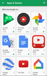


This new change might be hard to catch the eyes but is substantially using the space on the screen. The image above contains no cards and if you may have noticed, there are no borders to separate the apps like it used to be earlier. It seems as if the Card Style UI is slowly fading away from Google apps. The update is a server side one and might be in the testing phase for now. For brief comparison of the changes, take a look below -


The image on the left shows the old interface with cards and borders with every app icon and on the right is the new cleaner interface that doesn't have any of the cards or borders. Since the update is already under testing, you might see the same interface soon in your Play Store.
Do you like or dislike this modification? Let us know in the comments.
Google Is Taking The Road Of 'No Card Style' In The New Play Store UI
 Reviewed by Rajat Kapoor
on
3/18/2017 09:35:00 PM
Reviewed by Rajat Kapoor
on
3/18/2017 09:35:00 PM
Reviewed by Rajat Kapoor
on
3/18/2017 09:35:00 PM
Subscribe To Us
Get All The Latest Updates Delivered Straight To Your Inbox For Free!